For the
designblitz assignment of week 6 the suggestion was to carry around a camera during the week and to take photographs of designed examples around. I tried and succeeded on two days of this week. Though I felt somewhat limited in my skills to take photographs while carrying bags or having a cloudy day or not being able to carry around my good camera which is too heavy. I like eleven of the pictures I was able to take.
With these photographs I tried to catch some of the following elements of design:
color
typography
metaphors/symbols
minimalism & use of space
form/function/message
balance
rhythm
proportion
dominance
unity
I mainly were attentive to rhythm:
 |
| Part of a poster on a column. |
 |
| Stones arranged into a sidewalk. |
 |
| A sculpture. |
 |
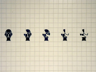
| A streetcar station. |
Other pictures for different design elements are:
minimalism:
 |
| Here someone imagines Europe in the future and adds symbols for presumed agrees, constitutions and peace treaties. |
 |
| A sad Graffiti on a staircase. |
color:
 |
| Colored Houses. |
 |
| Colorful lights bhind glass and snowflakes. |
typography:
 |
| Design of a Subway station. |
secret messages:
 |
| Maybe this contains a message which I can not decipher because I have not enough information. |
 |
| These messages you can find all over the city, who knows what they mean. |
Learning about design was interesting to me, because I could add to my knowledge I have collected as a fine artist and story illustrator. Design items seem to be more neatly put together and are more often signs and symbols and letters, which may be a naïve view to design. It is just a quality I realized concerning design this week. I may be able to express this more accurately in some time.


No comments:
Post a Comment