For this week five assignment we were supposed to go to a place and and to shoot photos after a given general description:
Make an ordinary object look more interesting, almost supernatural.
Take a photo that makes use of converging lines.
Take a photo dominated by a single color
Take a photo of something at an unusual angle
Take a photo of two things that do not belong together.
Take a photo that represents the idea of “openness”
Take a photo that expresses a human emotion
Take a photo emphasizes mostly dark tones or mostly light ones.
Make a photo that is abstract, that would make someone ask, “Is that a photograph?”
Take a photo of an interesting shadow.
Take a photo that represents a metaphor for complexity.
Take a photo of someone else’s hand (or paw)
There was also a time window of 20 minutes given.
I chose my place to take the photographs, because it is pretty cold outside and a cloudy day. It was interesting how the time pressure made me do surprising decisions. Yet, I did not feel good with it, but somehow confused and hurt. Something inside me needs to have time for any creation, otherwise I get uneasy. I actually could not resist to work on any photograph as if the time which was taken from me by following instructions has to be added again. This way I like the result of the photoblitzing assignment.
You can find my photoblitzing series on flickr.
It was rewarding to look through the work of fellow ds106 students. I choosed three of them to display here for my appreciation. Yet, there were many more good images. For this go to flickr and search for ds106photoblitz.
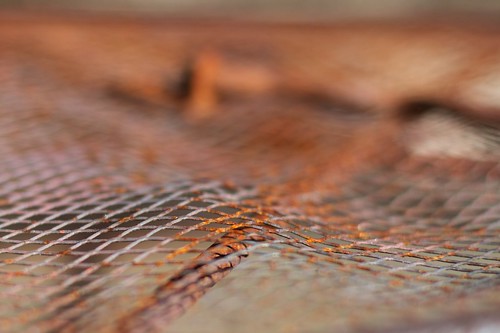
I don't know if this photograph means complexity to me as to the artist who shoot this, but I like the wave in it, which gives the image a touch of motion
I like the relaxed look of this picture. I suppose it is meant as converging lines. Most people would try to make it very accurately, as I did, but here the lines are arranged more interesting in the given space.
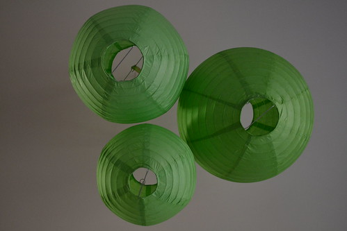
Here I like the colors and the way the three round shapes are arranged in the picture. In summary it appears somehow playful.


![121910074744[1]](http://farm9.staticflickr.com/8181/8040268586_eba1726808.jpg)

No comments:
Post a Comment